Let's examine another month of my actual weight history.
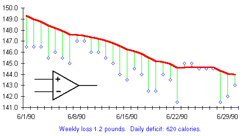
From what we've learned already, this month is easy to interpret. It's a month of rapid weight loss proceeding at a steady pace. As we've seen before, the trend chart can be used to calculate the average daily calorie deficit for the month it represents. That indicates the extent of the excess or shortfall of calories entering the rubber bag that month.
Carrying out these calculations indicates a weight loss of 1.2 pounds
per week, equivalent to a shortfall of 620 calories per day.
And what is that symbol beneath the trend line? It seems familiar.
Why...it's the comparator from the eat watch diagram on page
![]() . What is the relationship between the
change in the trend line from day to day and the balance of calories
computed by the eat watch?
. What is the relationship between the
change in the trend line from day to day and the balance of calories
computed by the eat watch?
Quite simple, they are the very same thing.