Excel users can easily prepare long-term charts that show daily weight and the course of the trend over a number of months. From the WEIGHT menu, you can select any of the following of charts, illustrated here with my weight data from 1989.
WEIGHT QUARTERLY CHART plots data for the last three months:
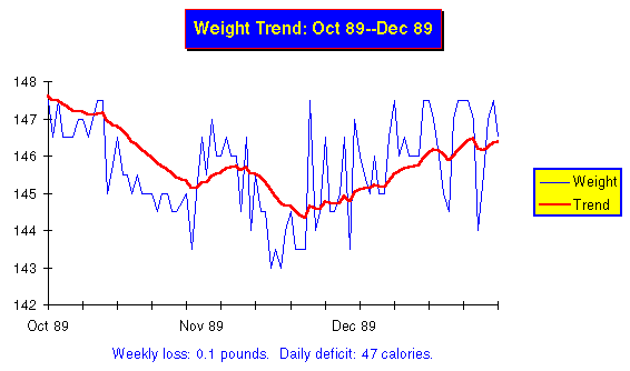
Long term charts show only the daily weight and trend, with the weight plotted as a thin blue line and the trend as a thick red one (obviously, you'll need a colour screen and/or printer to appreciate the colour, but you can tell the lines apart by their thickness even in black and white.)
WEIGHT SEMIANNUAL CHART shows the last six months in the same format as the quarterly chart.
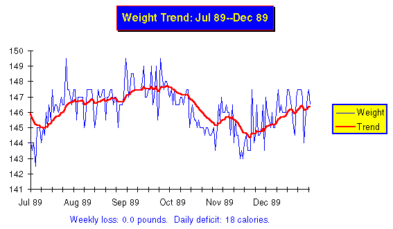
Notice how the longer term view changes the appearance of the chart. What looked like a reversal of trend on the quarterly chart now is seen more a part of a lazy drift back and forth around my weight goal of 145. For an even more distant view, choose WEIGHT ANNUAL CHART to plot the last 12 months.
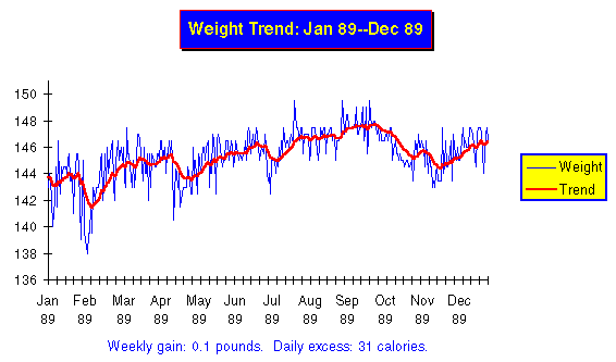
This shows that over all of 1989, as measured by the trend, my weight varied only from 142 through 147.5, and that the changes within that band were gentle. This is a picture of the eat watch in action: providing proportional negative feedback to keep my weight within a couple of pounds of the goal of 145.
You can make a chart of the entire historical database, back to the very first weight you entered, by selecting WEIGHT COMPLETE HISTORY CHART.
Obviously, you won't be able to produce a quarterly chart until you've collected three months of weight data, or a semiannual or annual chart until you have six or twelve. Be patient, let the data pile up, and before long you'll be able to review your progress over the months. File the long term charts you print in the ``Long Term Charts'' section of your logbook. You'll find them interesting to review on occasion, particularly as they come to document your weight loss and subsequent success in maintaining your goal.
If you're charting by hand, I don't recommend going to all the trouble of re-plotting to make long term charts. The easiest way to obtain a longer view is to remove the charts for a series of months from your logbook and arrange them, overlapping one another, on your desk or on the floor, to form a wide chart. Be sure to line up the charts so the same weight is at the same place on the vertical grid. You can also photocopy the monthly charts then tape the copies, properly aligned, into a scroll. You can unwind the scroll to see any long term view you like. If you do decide to plot long term charts, don't bother with the daily weights. Just plot the trend, since plotting the daily weights doubles the time and makes the resulting graph look ``busy.'' The daily weights contribute nothing to the analysis; the Excel macros plot them because it takes no longer for the computer to do it, and it's interesting to see the long term relationship between the weight and trend.
By John Walker