To see how moving averages can show the true trend of weight among the confusion of daily weight readings, we'll turn now to the unsuccessful diet of Movin' Marvin. Marvin lost 10 pounds in a little less than two months, then gained back most of it. (I'm forced to use this depressingly familiar circumstance in order to demonstrate how moving averages behave in both downtrends and uptrends.)
The true course of Marvin's diet is shown by this graph.
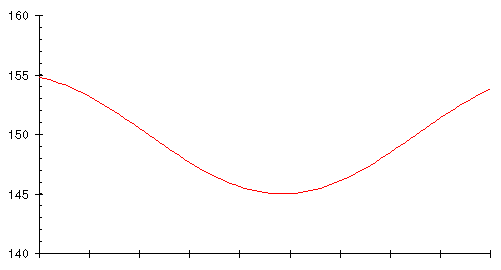
The vertical axis gives his weight in pounds, while the horizontal axis is marked every 10 days. This graph is an idealised representation of Marvin's true body weight. A chart like this would result if every day Marvin were subjected to medical tests that measured his actual weight, disregarding transient contents of the rubber bag.
Not wishing to be probed, scanned, or poked with needles, Marvin relies on the scale for weight. This gives him a graph that looks like this.
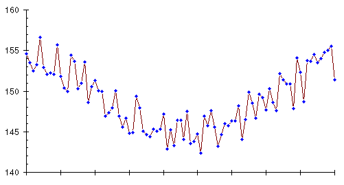
Knowing the true weight trend, you can see it despite the day to day jitter of the weight readings. Marvin, however, doesn't know the trend nor can he see the course of his diet laid out in advance. He has to live through the creation of this graph, day by day, and if you examine a week or so of weights, you'll see that these numbers hold just as much potential for false optimism and heartbreak as Dexter experienced in the course of his successful diet.