|
|
You can't make what you can't measure because you don't know when you've got it made.—Dr. Irving Gardner
We've traveled far, and learned much along the way. We waded through
all these details in search of an eat watch: a way to know, day in and
day out, how much to eat to achieve any weight goal we choose.
And now we know exactly what an eat watch must do, if not yet how to
make one.
In The Rubber Bag chapter we learned how the human body gains and loses weight: by eating too many or too few calories compared to what it burns. Further, we discovered that for most of us, adjusting the amount we eat—what goes into the rubber bag—is the only practical way to control our weight. Therefore, an eat watch must be able to measure the balance of what goes in and what gets burned: to calculate whether we're getting enough, too little, or too much food.
In the Food and Feedback chapter we learned why some people constantly gain weight, while others maintain a constant weight, and still others seem trapped on a rollercoaster of gain and loss. It became clear that the mechanism, if not the cause, of most weight problems is a lack of negative feedback: a failure to adjust, by appetite, the amount eaten to the amount burned. The eat watch must then provide feedback, in a manner that will stabilise the system: allow you to achieve and maintain your desired weight.
The eat watch began as a mythical device, a miracle cure beyond reach. But along the way we've collected enough information about the body and about feedback to design something that does the job.
By pulling together what we know about the eat watch, the rubber bag, and feedback, we can draw a wiring diagram for an eat watch, even though we may not yet know how to build some of the components.
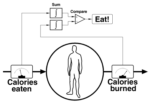
We start with the simplified rubber bag view of the body. We've installed meters to measure the rate at which calories go in and get burned. The readings from these meters, which vary as the creature inside the rubber bag awakes from a deep sleep, drinks a cup of coffee with two teaspoons of sugar, then runs to catch the bus, are fed to “integrators”—boxes that add up calories over a period of time, say 24 hours, and report the total. The totals are sent to a comparison unit that subtracts the calories burned from calories eaten. The result of this is precisely what we're looking for: the calorie shortfall (if negative) or excess (if positive) that determines whether the rubber bag burns off fat or packs it on. The indicator on the eat watch says “Eat!” whenever the balance is negative and goes out when it's positive.
As long as you only eat when the “Eat!” indicator is lit, you'll never gain weight. If you'd like to lose some weight, simply adjust the indicator so it comes on only when the sum is negative by more than some number of calories. Suppose you want to take off 10 pounds over two months. Just work out the total calories you have to burn by multiplying the pounds you wish to lose by the calories in a pound of fat, 10 × 3500 = 35000, divide by the number of days in two months, 35000 / 60 ≈ 585, and set the “Eat!” light to come on when the result is less than −585. To put on 2 pounds in 30 days, adjust it to say “Eat!” whenever the difference is +233 ((2 × 3500) / 30) or less.
With an eat watch helping to balance the nutritional books on a constant basis, you'll never err very far in the direction of too many calories. Consequently, you'll never have to atone by cutting your calorie intake way back. In other words, once you're done peeling off your extra weight, you'll never be hungry again, as long as you rely on the eat watch.
Let us repair to the workshop and try to turn this back of the envelope sketch into hardware. Rummaging through the parts bin, we quickly find all the components at the top of the diagram. Integrators, comparators, and indicators are available for pennies apiece.
We come up short, however, looking for those confounded meters that read calories in and out. It's possible to measure these quantities, at least in principle. If you were crazy enough to do so, you could calculate calories in by looking up everything you ate, as you ate it, in a calorie counting book and punching in the numbers on a keyboard. You could track calories burned by measuring body temperature, blood sugar, heart and respiration rates, etc., especially if you were willing to calibrate the readings for your own body over a month. Biosensors that measure these quantities have been used on astronauts, athletes, and intensive care patients for years.
But the whole idea of the eat watch is to be unobtrusive and not disrupt your life! Being slim and trim and the envy of your peers loses a lot of its gloss if it means spending the rest of your life wired up like a labrat. “Bend over, please, this won't take but a moment.”
No.
But it could be done. This is encouraging.
Let us stand up straight, step back from the yawning chasm of the absurd, shrug off the bioharness, and ponder whether there might be a better way of going about this. Perhaps the linkage between cause (calories eaten and burned) and effect (weight gained and lost) could be used to accomplish the same results without ending up as a cyberpunk centerfold.
After all, what we care about is weight, not calories. Might there be a way to extract the information we need from the weight numbers served up so easily by the scale? Indeed there is, but extracting the information we seek, calorie balance, from the confusing welter of weight measurements requires another mathematical trick borrowed, not from engineering but from the toolbox of the stock and commodity trader.
Like most attempts to characterise a complicated system by a single number, a scale throws away a great deal of the subtlety. Every morning the rubber bag sloshes over to the scale and heaves itself onto the treads with a resounding splorp. The scale responds with a number that means something or other. If only we knew what…. Over time, certainly, the scale will measure the cumulative effect of too much or too little food. But from day to day, the scale gives results that seem contradictory and confusing. We must seek the meaning hidden among the numbers and learn to sift the wisdom from the weight.
On July 1, Dexter went on a diet, resolute in his intention to shed 10 pounds before Labour Day. Every morning Dexter weighed himself and wrote the number on a piece of paper. Every evening, he plotted his weight on a graph and wrote any comments that came to mind in his Diet Diary. Let's relive those two months of Dexter's life by peeking at the records he kept.
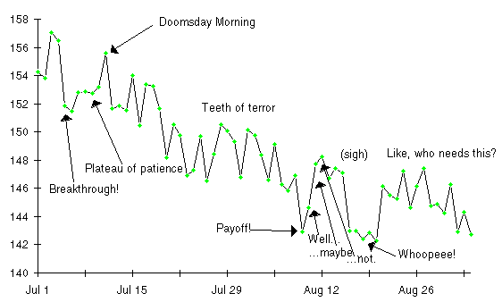
Here I go, and this time I'm going to succeed. I'd better—I've told everybody at the office I'm going on a diet, and if I don't slim down this time they'll rib me all the way 'till Christmas. So, farewell indulgence, hello Dexter's Slimming Summer.
All right! One day, almost half a pound! I'm already ahead of schedule. At this rate….
Woe is me. Last night I got up, went into the pantry, and just looked at the popcorn jar. That's all. And today I woke up three pounds heavier than when I started to diet. My stomach is growling, my soul is bruised, and my weight is up. Good night.
Some glorious Fourth. Well, at least the porkometer is down from yesterday. But it would be amusing if I could get back below where I started this diet, wouldn't it?
Oh frabjous day, the diet is finally kicking in. Four pounds less, more than two below where I started! I shall not conclude the onion ring I swiped from yon Cassius at dinner had anything to do with it. Onward!
Stuck on this pesky plateau. Still, I guess it's better to be stuck below where I started than spiraling upward toward Chandrasekhar's limit.
One measly bowl of sauerkraut at bedtime, for the sake of Almighty Bob! I mean, every diet book says that stuff has fewer calories than sawdust, but boom!—here I am, almost two weeks into this cruel torture ritual, still two pounds above where I started. If it weren't so late and I weren't so tired I'd go make a double scoop sundae and chuck this damnable diet.
Well, that's interesting. Yesterday must have been a blip. Either that, or maybe panic and depression is what really causes me to lose weight.
Gosh, has it been three weeks? Well, not very interesting weeks, anyway. The occasional new low, but basically I'm stuck in an up and down cycle that's running about a week long. Maybe my body has adapted to this diet and I'll go on being hungry forever and never lose another pound. There's a cheerful thought.
Maybe there's justice in the universe after all. One hundred and forty-three pounds…I've done it! Now, if I just stay here this diet is history!
Up one and a quarter. Diet history doesn't lie in this direction.
Is my life some kind of cruel experiment to see if somebody can never get a single break, or what? Shit in a sugar cone! I've eaten nothing: nothing extra, and I pack on five pounds in two days? I weighed less than this almost three weeks ago. Why go on?
Truly marvelous. Up another half pound.
At least it's lower today.
Well, maybe this has finally paid off. I seem to have settled down below my goal of 144 pounds at last. These new clothes feel great, and for the first time in two years I don't feel like a fatty.
Beach party! Had a wonderful time. What a joy to have a hot dog with mustard and relish and not worry about my weight!
Up four pounds in one day. I'm sure I didn't eat any sand. I don't relish the prospect of a life without hot dogs.
Examining Dexter's weight chart and diary evokes memories of similar times of triumph and days of despair in anybody who has dieted. Dexter exulted with each new low on the scale, while fearing it wouldn't last. He grew depressed as weight plateaus extended from days into weeks. His spirits rose and fell with the daily readings on the scale. When a month's progress was seemingly erased in a single day, a part of Dexter's joy in life withered and died.
Yet despite the ups and downs of the scale and the emotional battering they administered to Dexter, his diet worked perfectly, achieving precisely the result he intended in the anticipated time. Dexter was deceived by his scale. It didn't measure what he cared about: pounds of fat. Instead, the changes in daily weight reflected primarily what happened to be in the rubber bag at the instant it was weighed.
The detailed picture of what goes in and out of the rubber bag explains why daily weight measurements have so little to do with how fat you really are. Dexter went on a two month diet to lose 10 pounds. And yet every single day, on average, a total of 13.5 pounds of food, air, and water went into Dexter's rubber bag, and a comparable amount went out. His daily weight loss during the diet was less than one fifth of a pound per day, yet each and every day almost 80 times that weight passed through his body!
If the body consumed and disposed of these substances on a rigid schedule, maintaining a precise balance at all times, weight would be consistent from day to day. But that is not the way of biological systems. A few salty potato chips are enough to cause the body to crave, drink, and retain a much larger amount of water to dilute the extra salt. The body's internal water balance varies widely over the day and from day to day. Since water accounts for three quarters of everything that goes into and out of the rubber bag, it dominates all other components of weight on the scale.
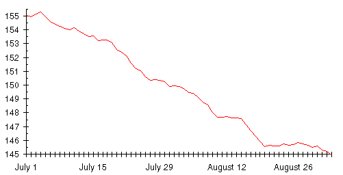
Every morning, when Dexter stepped on the scale, it's as if he carried, unknowingly, a water tank filled to an unknowable level by a mischievous elf, put there to confound his attempt to track the progress of his diet. If Dexter's scale had been able to disregard the extraneous day to day changes in weight, it would have produced a graph like this.
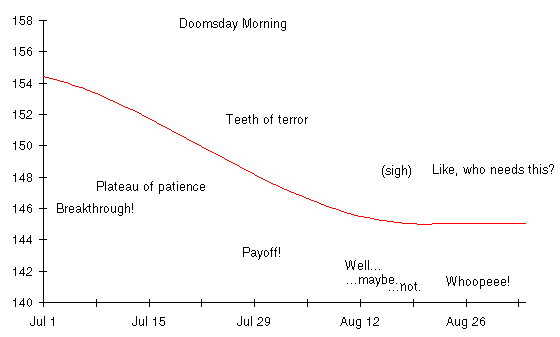
Shortly after Dexter began his diet, he started to lose weight. He continued to lose until he declared the diet successful in the third week of August, after which his weight leveled off at the goal of 145 pounds. Imagine how calm and confident Dexter's diary would have been if he'd plotted this curve instead of daily weight.
By relying solely on daily weights from his scale, Dexter endured two months of unnecessary suffering. His diet worked, as was inevitable from a simple calculation based on the rubber bag, but the day to day weight readings obscured his steady progress. An eat watch would have assured Dexter he was on the right course and making steady progress toward the goal. The scale seems, by comparison, a modern instrument of psychological torture, an engine of confusion and despair. Can it be made to tell the truth?
You've seen the daily weight chart that so exasperated Dexter. You've seen the graph of Dexter's actual weight after correcting for all the variations caused by the momentary contents of the rubber bag. Consider this graph. The solid line is Dexter's true weight and the dashed line is produced by applying a simple mathematical procedure to the weight numbers from the scale, those foul figures that so vexed Dexter as he dieted.
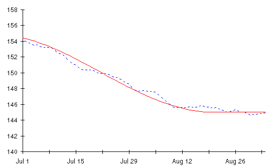
Hidden all along among the random day-to-day variations in weight was what really mattered to Dexter: how much fat his body packed. All the despair, all the premature hope and subsequent betrayal could have been avoided had Dexter only known how to extract the truth about his body from the numbers on the scale.
We shall now learn how to do this.
To extract the small change in body fat from the much larger day to day variation in weight that's largely a consequence of water flowing in and out of the rubber bag, we need to find the trend beneath all the daily variations: the long term direction of weight. But this is hardly a new problem; stock and commodity speculators have been doing this for over a century.
Here's the kind of raw data a stock trader looks at. This is a chart of the daily closing price of the stock of Autodesk, Inc., the company I founded, in the eventful year of 1987. That year saw Autodesk hit all-time highs, get clobbered by the Crash of '87, then begin a slow recovery as the year ended (which eventually carried it to a high of $60/share in 1990).
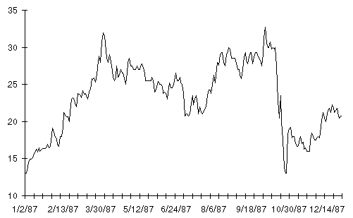
The price action of Autodesk in 1987 was more clearcut than in most years, yet an investor who looked at each day's price as it was quoted in the paper would suffer the same kind of ups and downs as Dexter endured throughout his diet. The most common technique for extracting an underlying trend from daily price data is a moving average. Here's a moving average view of Autodesk stock in 1987. The moving average is the red line; the daily stock price is shown in black.
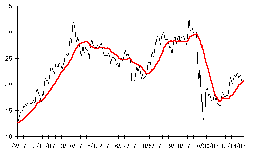
The moving average has distilled the trend from the daily price fluctuations. The six major up and down trends of the year are now readily apparent. If you'd owned the stock only while the moving average was rising you'd have ended the year with a tidy profit, notwithstanding having your gains from August through October wiped out in a single day by the Crash. (Whether price charts and moving averages can predict the future price of a stock or commodity is controversial; many speculators swear by them and have profits to show for it while the majority of economists believe it's all nonsense. Here we aren't trying to predict anything; we're using a moving average solely to clear away the day to day clutter in order to see larger, long term changes. Nobody disputes the validity of moving averages for this; they are so used in many areas, for example, plotting an airplane's course from a series of radar returns.)
To see how moving averages can show the true trend of weight among the confusion of daily weight readings, we'll turn now to the unsuccessful diet of Movin' Marvin. Marvin lost 10 pounds in a little less than two months, then gained back most of it. (I'm forced to use this depressingly familiar circumstance in order to demonstrate how moving averages behave in both downtrends and uptrends.)
The true course of Marvin's diet is shown by this graph.
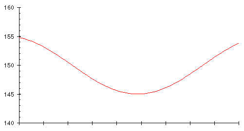
The vertical axis gives his weight in pounds, while the horizontal axis is marked every 10 days. This graph is an idealised representation of Marvin's true body weight. A chart like this would result if every day Marvin were subjected to medical tests that measured his actual weight, disregarding transient contents of the rubber bag.
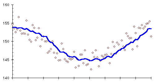
Not wishing to be probed, scanned, or poked with needles, Marvin relies on the scale for weight. This gives him a graph that looks like this.
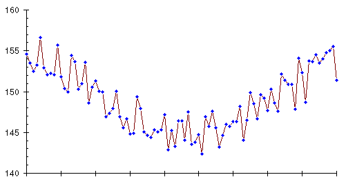
Knowing the true weight trend, you can see it despite the day to day jitter of the weight readings. Marvin, however, doesn't know the trend nor can he see the course of his diet laid out in advance. He has to live through the creation of this graph, day by day, and if you examine a week or so of weights, you'll see that these numbers hold just as much potential for false optimism and heartbreak as Dexter experienced in the course of his successful diet.
When faced with apparently random variation in a collection of things, the first thing a statistician does is compute an average or, more precisely, the arithmetic mean. What's the average height of 30 year old men? Measure a whole bunch of them, add up their heights, and divide by the number you measured. Whether the number you get is useful for anything is another matter, but at least you can always easily calculate an average.
Since the weight trend is being obscured by an apparently random day to day variation caused mostly by the instantaneous water content of the rubber bag, what about averaging several day's weights and plotting the averages instead? Let's try it; take the weights for each 10 day period on the graph, calculate the average, and plot it as a little square in the middle of the 10 day interval. Here's the result, overlaid on the original chart showing the true weight trend.
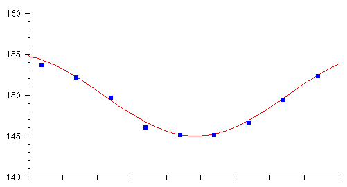
It looks like we're on to something here! The averages track the trend very closely indeed. Averaging has filtered out the influence of the daily variations, leaving only the longer term trend. But we can do even better. Rather than waiting for ten days to elapse before computing the average, why not each day calculate the average of the last ten days? This will give us a continuous graph rather than just one box every ten days, and we don't have to wait 10 days for the next average. Here's what happens when we try this scheme.
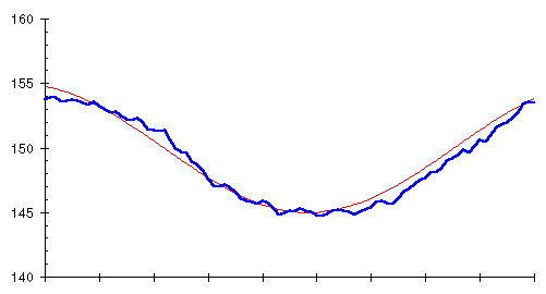
Bingo! Averaging the last ten days and plotting the average every day (the heavy blue line) closely follows the trend of actual weight (the thin red line). What we've just computed is called a 10 day moving average, “moving” because the average can be thought of as sliding along the curve of raw weight measurements, averaging the last 10 every day.
You'll notice, if you look closely at the two curves, that the moving average, although the same shape, lags slightly behind the actual trend. This occurs because the moving average for each day looks backward at the last 10 days' data, so it's influenced by prior measurements as well as the present. The lag might seem to be a problem at first glance, but it will actually turn out to be advantageous when we get around to using a moving average for weight control.
We can base a moving average on any number of days, not just 10. Here are 5, 10, 20, and 30 day moving averages of Marvin's daily weight.

As the number of days in the moving average increases, the curve becomes smoother (since day to day fluctuations are increasingly averaged out), but the moving average lags further behind the actual trend since the average includes readings more distant in the past.
The uncanny way a moving average ferrets the trend from a mass of confusing measurements can be seen by plotting the 10 day moving average along with the original daily weights, shown as small diamonds.
The moving averages we've used so far give equal significance to all the days in the average. This needn't be so. If you think about it, it doesn't make much sense, especially if you're interested in using a longer-term moving average to smooth out random bumps in the trend. Assume you're using a 20 day moving average. Why should your weight almost three weeks ago be considered equally relevant to the current trend as your weight this morning?
Various forms of weighted moving averages have been developed to address this objection. Instead of just adding up the measurements for a sequence of days and dividing by the number of days, in a weighted moving average each measurement is first multiplied by a weight factor which differs from day to day. The final sum is divided, not by the number of days, but by the sum of all the weight factors. If larger weight factors are used for more recent days and smaller factors for measurements further back in time, the trend will be more responsive to recent changes without sacrificing the smoothing a moving average provides.
An unweighted moving average is simply a weighted moving average with all the weight factors equal to 1. You can use any weight factors you like, but a particular set with the jawbreaking monicker “Exponentially Smoothed Moving Average” has proven useful in applications ranging from air defence radar to trading the Chicago pork belly market. Let's put it to work on our bellies as well.
This graph compares the weight factors for an exponentially smoothed 20 day moving average with a simple moving average that weights every day equally.
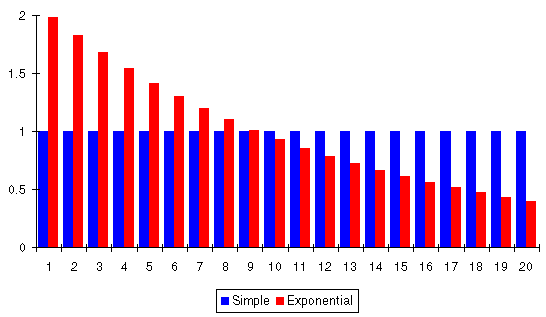
Exponential smoothing gives today's measurement twice the significance the simple average would assign it, yesterday's measurement a little less than that, and each successive day less than its predecessor with day 20 contributing only 20% as much to the result as with a simple moving average.
The weight factors in an exponentially smoothed moving average are successive powers of a number called the smoothing constant. An exponentially smoothed moving average with a smoothing constant of 1 is identical to a simple moving average, since 1 to any power is 1. Smoothing constants less than 1 weigh recent data more heavily, with the bias toward the most recent measurements increasing as the smoothing constant decreases toward zero. If the smoothing constant exceeds 1, older data are weighted more heavily than recent measurements.
This plot shows the weight factors resulting from different values of the smoothing constant. Note how the weight factors are all 1 when the smoothing constant is 1.
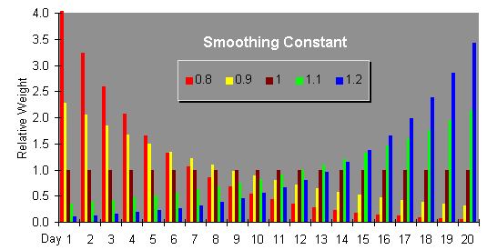
When the smoothing constant is between 0.5 and 0.9, the weight given to old data drops off so rapidly compared to more recent measurements that there's no need to restrict the moving average to a specific number of days; we can average all the data we have, right back to the very start, and let the weight factors computed from the smoothing constant automatically discard the old data as it becomes irrelevant to the current trend.
Replacing the simple moving average with an exponentially smoothed one with a smoothing constant of 0.9 (roughly equivalent to a 20 day simple moving average in terms of lagging the trend), we get the following plot showing the trend line produced by the moving average versus the original daily weights from which it was calculated.
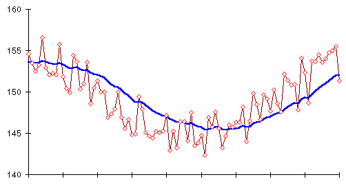
At last we've found a tool that accurately extracts the trend of actual body weight, the direct consequence of the balance between what goes in to the rubber bag and what gets burned, from all the distraction and confusion based on whatever's in the bag at the moment you step on the scale. Now we'll learn how to interpret this trend line.
Armed with this new and potent tool, the moving average, let's reexamine Dexter's vexatious diet. This is how Dexter would have seen his weight loss if he'd plotted the exponentially smoothed moving average with smoothing constant 0.9 instead of daily weight. (This chart assumes Dexter had been recording his weight for a couple of weeks before he began the diet. If he hadn't, the first few days would look a little different but the rest of the graph would be identical.)
What a different view this is from the soul shredder called a “daily weight chart”!
The right way to think about a trend chart is to keep it simple. The trend line can do one of three things:
That's it. The moving average guarantees the trend line you plot will obviously behave in one of these ways; the short term fluctuations are averaged out and have little impact on the trend.
The first thing to observe from the graph is what strikes you at first glance: it goes down! Further, after the first week, as the diet begins to take hold, it goes down relentlessly until Dexter declares the diet a success at the end of August. To be precise, in the 51 days of Dexter's diet, here's the breakdown of day to day changes in the trend.
| What happened? | How many days? |
|---|---|
| Went up | 4 |
| Went down | 37 |
| Stayed the same | 10 |
Despite all the weight swings that so disturbed Dexter there were only four days when the trend line rose. The next thing to notice is how accurately the trend line approximates a straight line during the middle of the diet. Dexter had cut his food intake consistently and expected a steady weight loss. That's what happened, but the loss was hard to discern on the scale. The trend line makes it immediately apparent.
Next, consider the trend line along with the daily weights from the scale.
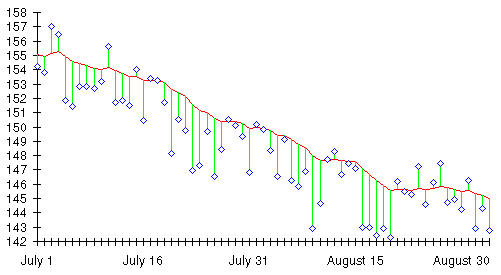
The trend line is drawn in as before, and each day's weight is plotted as a diamond. I've drawn lines from each weight measurement to the trend line to show the relationship between daily weight and the trend that day. Remember, in an exponentially smoothed moving average the most recent day's measurement has the greatest influence on the trend line. Recall also, that since the moving average looks back in time, it lags the actual trend. Consequently, when the trend is falling, most of the daily weights will be below the moving average trend line. Think of the trend as a fishing line in the water. Daily weights that fall below it are sinkers, pulling it down; the further the weight is below the trend line, the stronger it pulls the trend line down. When the trend is rising, most daily weights will be above the trend line: floats, tethered to the line, pulling it up.
The relationship between the trend line and the daily weights is another powerful indicator of what's really going on. It provides important information to Dexter during the course of his diet. No tabulation is required; a simple glance at the chart shows that regardless of all the ups and downs in daily weight, discounting a very few exceptions, the trend line, the indicator of Dexter's true weight, was being pulled down continuously. The apparent weight plateau that frustrated Dexter in the days preceding July 10th is seen in a very different light now. Even though his weight on the scale stubbornly refused to budge for about a week, every weight that week fell below the trend line and, consequently, dragged it downward.
The few days on which the rubber bag was brimming with water or what NASA refers to delicately as “solids,” those days that occasioned Dexter such despair when viewed in isolation, are also seen in much better perspective on this chart. Many of these days, in fact the great majority, are actually below the trend line and still, regardless of their relationship to earlier days, act to pull it down. Those that manage to pop above the trend line have an impact on it which is clearly insignificant.
The relationship between the daily weight readings and the trend line is not only a powerful psychological tool in controlling weight, it also provides early warning about shifts in calorie intake and therefore changes in the trend of weight. While you're losing weight, you'll see a chart that looks like Dexter's: a falling trend line with most daily weights below it. Once you've stabilised your weight and are holding it essentially constant, you'll see a chart that looks like this, instead.
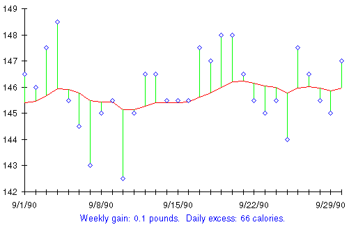
I don't have to make up a name for this individual; this is my own chart for September 1990. My true weight that month held essentially steady right where I want it, around 145 pounds. As measured by the trend line, my weight that month never exceeded 146 1/4 nor fell below 145 1/4. Yet, like Dexter, if I'd relied solely on the scale to track my progress, I'd have seen a very different picture. While my true weight didn't vary by more than a pound that month, the difference between the highest and lowest daily weights on the scale was six pounds—from a high of 149.5 to a low of 142.5. This chart shows the reality of stable weight, with the slightest discernable upward bias. The upward trend has been calculated to be equivalent to an excess of 66 calories a day, comparable to a single Oreo cookie, half a tablespoon of mayonnaise, or 5 peanuts roasted in the shell (each 50 calories), or half a can (6 oz.) of Pepsi (79 calories).
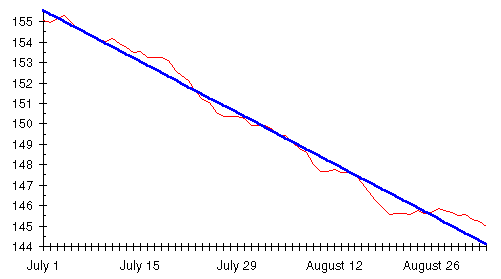
When the trend shifts from weight loss to gain, whether by intention (as in the following chart) or accidentally, the direction of the trend line and the relationship of the daily weights to it quickly diagnose the situation. Here's another of my own weight charts, this one from March of 1990. That month I'd slipped a little below my target of 145, so I decided to indulge in a few extra treats to bring my weight back up to the goal.
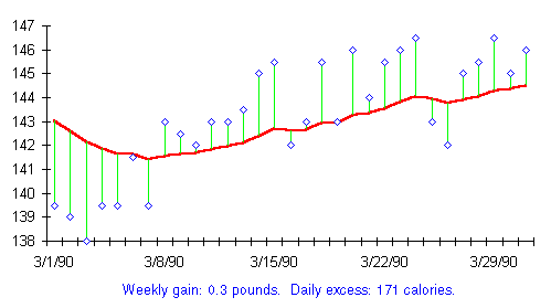
Note the dramatic change around March 8th, as I pushed the feeding throttle up a notch. The weight readings, which had previously been mostly below the trend line, pulling it down, shifted predominantly above it, dragging it back upward. The prior downtrend was arrested and gave way to a comparable mild uptrend amounting, over the month, to a rate equal to a third of a pound per week. This was accomplished eating about an extra 170 calories a day, an adjustment I made by enjoying either a bowl of popcorn or a couple of slices of cheese in the evening.
If I hadn't been deliberately bringing my weight up to the target but had, instead, inadvertently thrown my weight out of balance by munching the odd handful of pistachio nuts (1 oz. = 170 calories) in the afternoon, this chart would quickly make me aware of the trouble I was getting myself into. A gain of a third of a pound per week is a comfortable, easy way to drift upward when you'd like to add a few pounds but, if it goes unnoticed and unchecked, will leave you 17 pounds heavier in a year. The trend chart, if heeded, will keep such slow and subtle weight creep from blindsiding you. Whenever you see a chart like this one and you aren't deliberately putting on weight, just cut back a few calories a day to restore the balance before a real problem develops.
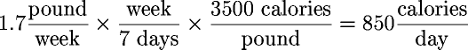
To complete the picture, here's my weight chart for August 1988—toward the end of the diet that took me from 215 pounds in January 1988 to my target of 145 in November that same year.
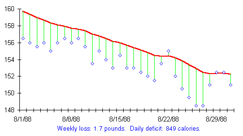
This chart is typical of a serious diet in mid-course: the trend line is more consistent than Dexter's chart since my diet was underway months before the first day on the chart. As you'd expect, virtually every daily weight fell below the already falling trend line and acted to pull it down. Although the daily weight jumped all over the place, the trend line was almost ruler-straight for the month, indicating weight loss at the rate of 1.7 pounds a week, or 850 fewer calories going in my rubber bag every day than I burned. (Unlike the stability or slow upward drift in the previous charts, a daily shortfall of 850 calories is serious business. When you constrict the intake of the rubber bag to that extent, the sentient being inside is going to say, “What happened?,” probably accompanied by colourful language and epithets too powerful for this fragile and flammable paper to contain. An 850 calorie per day deficit corresponds to a loss of 90 pounds a year, plenty to deal with all but the most extreme weight problems in relatively short order. Notwithstanding the realities of such a severe weight-loss regime, which I'll discuss in the Losing Weight chapter, it hardly implies incapacitation. That very month, August 1988, I researched, wrote, and presented the proposal that launched the Autodesk Cyberspace Initiative, our effort to make “virtual reality” technology available to everybody—to allow computer users to cross the barrier of the screen and directly experience the world inside their computers.)
The trend line, generated from the daily weight readings by an exponentially smoothed moving average, is so smooth and regular it can be used to calculate average weight gain or loss and, from that, the daily excess or shortfall of calories that caused the observed change in weight.
For longer term changes, simply subtracting the trend reading at the end of the month from the trend at the beginning and dividing by four gives a reasonable approximation of the rate of weight gain or loss per week during that month. Clearly, this number should be interpreted in conjunction with the chart. If the calculation indicates no weekly gain but the chart shows a steep uptrend for the first two weeks and a compensating decline in the latter two, the situation is not one of stability but oscillation, to be damped if possible.
Consider my chart for August of 1988. My weight, measured by the trend line, began the month at 159.74 and ended the month at 152.223 pounds. This represents a weight loss of:
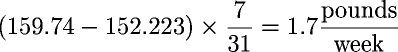
Since each pound gained or lost is equivalent to 3500 calories excess, stored as fat, or deficit, burned from fat by the rubber bag, this can be expressed as a daily calorie excess or shortfall by multiplying by calories per pound.
The Excel weight management worksheets actually use a more sophisticated and accurate technique to estimate the rate of weight loss or gain and the corresponding calorie shortfall or excess. Instead of just using the trend at the start and end of the month, they find a straight line that best approximates the overall trend and then use the slope of that line as the rate of change in weight. The mathematical details of this are given in the Pencil and Paper chapter. If you're calculating by hand, it isn't worth the extra work to get the slightly more accurate values this technique provides; just use the first and last trend values as described above.
Here is the straight line trend determined by this procedure superimposed on Dexter's moving average, from which it was calculated.
As you can see, the computed straight line trend accurately reflects the rate of change in the moving average. Fitting a straight line to the trend doesn't eliminate the need to interpret the weight loss or gain and calorie excess or deficit in conjunction with the chart, taking into account the shape of the trend line. Consider this chart of Marvin's diet, showing the moving average and two very different straight line trends that can be calculated from it.
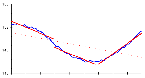
The familiar moving average trend line is drawn as before. The dashed line is the best fit to all 90 days of Marvin's diet. It's accurate, after a fashion, since Marvin ended the diet below the weight where he started, and he lost weight for 50 days but gained only in the last 40. But, obviously, it misses the point. What really happened was a sequence of successful weight loss, stability for a brief period, then rapid weight gain. Short term straight line trends, in this case month by month, identify the turnaround and provide accurate estimates of weight change and calories for each month.
As long as the moving average is roughly straight, the weekly weight and daily calorie figures can be relied upon. If there's a major change in trend during the month, you're better off basing your actions on the most recent direction of the trend rather than longer term values that don't account for a kink in the curve.
Let's examine another month of my actual weight history.
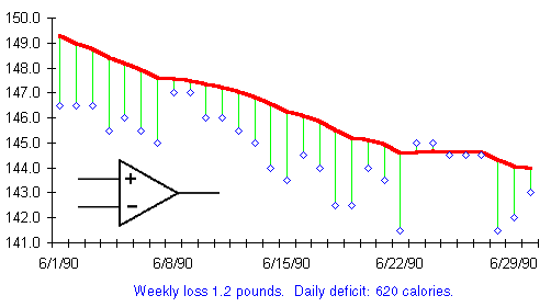
From what we've learned already, this month is easy to interpret. It's a month of rapid weight loss proceeding at a steady pace. As we've seen before, the trend chart can be used to calculate the average daily calorie deficit for the month it represents. That indicates the extent of the excess or shortfall of calories entering the rubber bag that month.
Carrying out these calculations indicates a weight loss of 1.2 pounds per week, equivalent to a shortfall of 620 calories per day. And what is that symbol beneath the trend line? It seems familiar. Why…it's the comparator from the eat watch diagram. What is the relationship between the change in the trend line from day to day and the balance of calories computed by the eat watch?
Quite simple, they are the very same thing.
The charts of Marvin's diet in this chapter were generated from an Excel worksheet that's included to allow you to experiment further on your own and get a better feel for how moving averages identify the overall trend among data that subject to large short-term variations.
To use this model, load the worksheet SMOOTH.XLS into Excel. You should see a something like this on your screen.
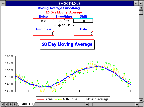
Depending on your monitor and graphics board, you may have to resize the window to see the entire worksheet. The chart shows the true trend line as a thin red line. This trend is masked by random variations from day to day, resulting in daily measurements drawn as green diamonds connected by yellow lines. The trend extracted by the selected moving average is drawn as a thick blue line. The closer the blue line approximates the red line indicating the true trend, the more effective the moving average has been in filtering out the short term random variations in the measurements.
You can control the moving average model by entering values in the following boxes of the control panel.
This parameter selects the type of moving average and its degree of smoothing. If positive, an exponentially smoothed moving average with smoothing constant equal to Smoothing is used. Only smoothing constants between 0 and 1 are valid. If negative, a simple moving average over the last −Smoothing days is used. To see the effects of a 20 day simple moving average, enter “-20” in the Smoothing cell.
The Noise value specifies the day to day random perturbation of the basic trend. If you set Noise to 10, the measured values will be randomly displaced ±5 from the true trend. The random displacement of points in the primary trend changes every time the worksheet is recalculated. To show the effects of a different random displacement of the current trend, press F9 to force recalculation.
Since a moving average looks back at prior measurements, it lags the current trend. You can shift the moving average backward in time to cancel this lag by entering the number of days of displacement in the Shift cell. This allows you to compare the shape of the trend curve found by various moving averages with the original trend. A Shift value of zero disables displacement and produces a moving average that behaves, with respect to the actual trend, just as one calculated daily from current data. For a simple moving average, a Shift of half the days of Smoothing will generally align the trend and moving average. For an exponentially smoothed moving average, a Smoothing value of 0.9 can be aligned with a Shift of about 10.
The trend used in this model is generated by a cosine function. Amplitude controls the extent of the trend; the peak to peak variation is twice the value of Amplitude.
Rate controls the period of the primary trend, specified as the number of days from trough to peak and vice versa. As you decrease Rate, the trend varies more rapidly, requiring a shorter-term moving average to follow.
Another Excel worksheet, BESTFIT.XLS, allows you to see how a straight-line trend is fitted to randomly varying measurements of an underlying trend, and the extent to which the trend line estimated this way reflects the actual trend.
Load the worksheet and resize the window as necessary so your screen looks like this:
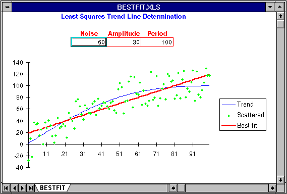
The actual trend in this model is a straight line that runs from zero to 100 over 100 days. You can introduce random noise into the measurements from which the trend is calculated by setting Noise to the width of the noise band. If Noise is 10, measurements are randomly displaced ±5 from the actual trend.
You can also add a sinusoidal variation to the basic straight line trend, anything ranging from a small amplitude, high frequency, wiggle to a large secular change that ties the trend line into a knot. Amplitude controls the extent of the deviation from a straight line; the trend will range from −Amplitude to +Amplitude around the basic straight trend line. Period controls how rapidly the trend line wiggles from its central value in terms of days between crest and trough.
The fundamental rising trend, modified by the sinusoidal variation specified by Amplitude and Period, is shown as a blue line. The raw data points that result from displacing values on that curve based on the setting of Noise are plotted as green diamonds. The straight line trend that best fits the noisy data points shown by the green dots is plotted as a thick red line. To the extent this line is representative of the actual trend in blue, the trend fitting procedure can be trusted. Note, as you experiment with this worksheet, how long period, high amplitude variation in the basic trend, equivalent to reversals in an established trend of weight loss or gain, can spoof the trend line calculation and yield misleading trend estimates.
|
|